
S&P 500 Market Analysis - A Historical Macro View Using EdgeMaker

What better way to kick off my Substack journey than with a deep dive into the historical macro trends of the S&P 500, analyzed through the lens of our powerful EdgeMaker indicator.
Without further ado, here’s $SPX since 1970:
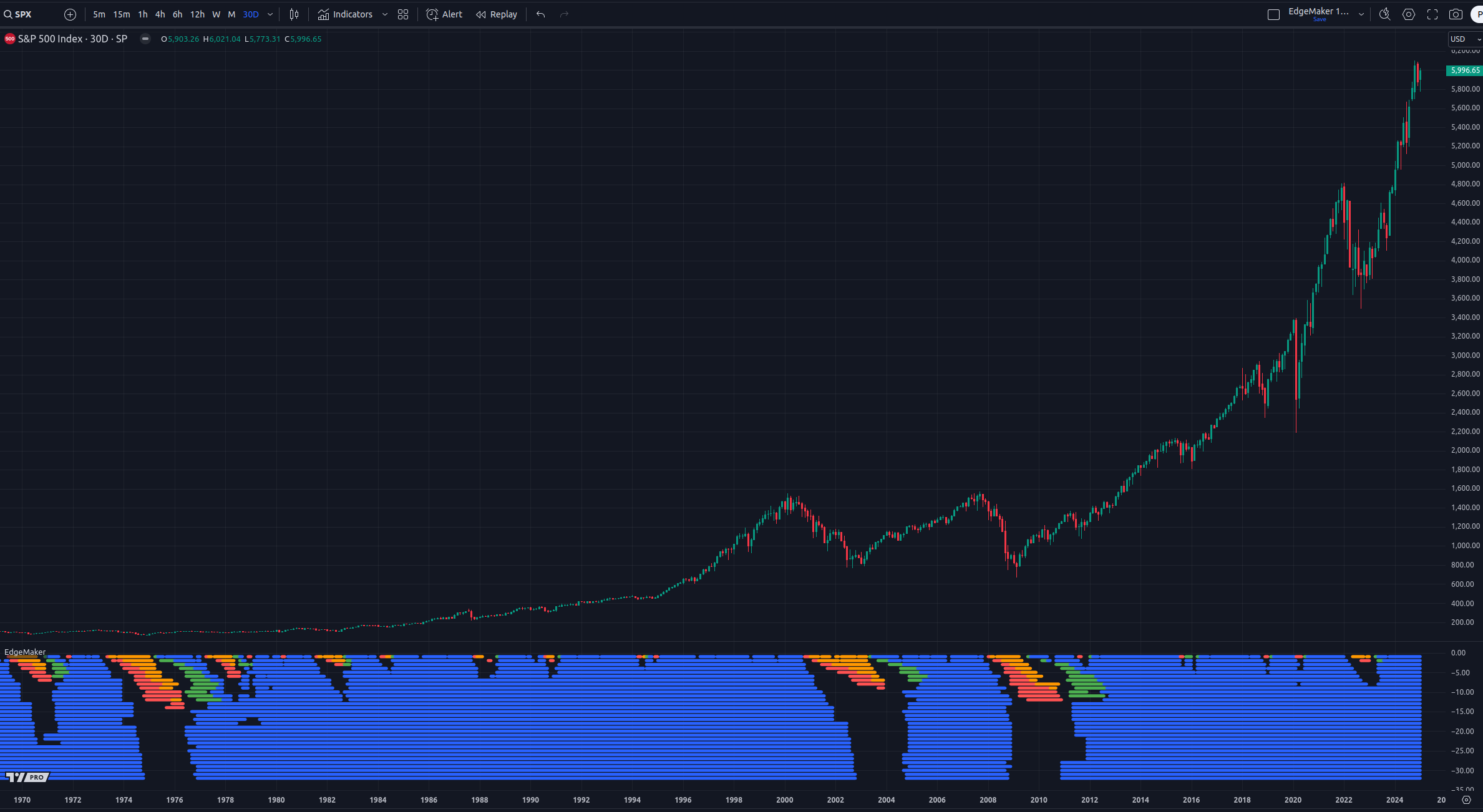
EdgeMaker Indicator Overview
Green Layers: Bullish price compression
Blue Layers: Bullish price expansion
Red Layers: Bearish price compression
Orange Layers: Bearish price expansion
This chart uses a 30D interval, which means each candlestick on the chart represents a duration of 30 days.
There are 32 horizontal layers in this extended macro view. Each layer represents a unique time frame (e.g. 7d, 14d, 21d) all the way up to 224d.
As you can see, this chart is dominated by blue layers, which represents bullish price expansion. Hence, no surprise $SPX is up 6800% in the last 54 years.
What’s beautiful about this indicator is it shows the most significant price surges when all the visible layers are blue. This represents confluence or alignment across time frames.
Let’s zoom in a bit to review the dot-com crash of 2000 and the financial crisis of 2008:
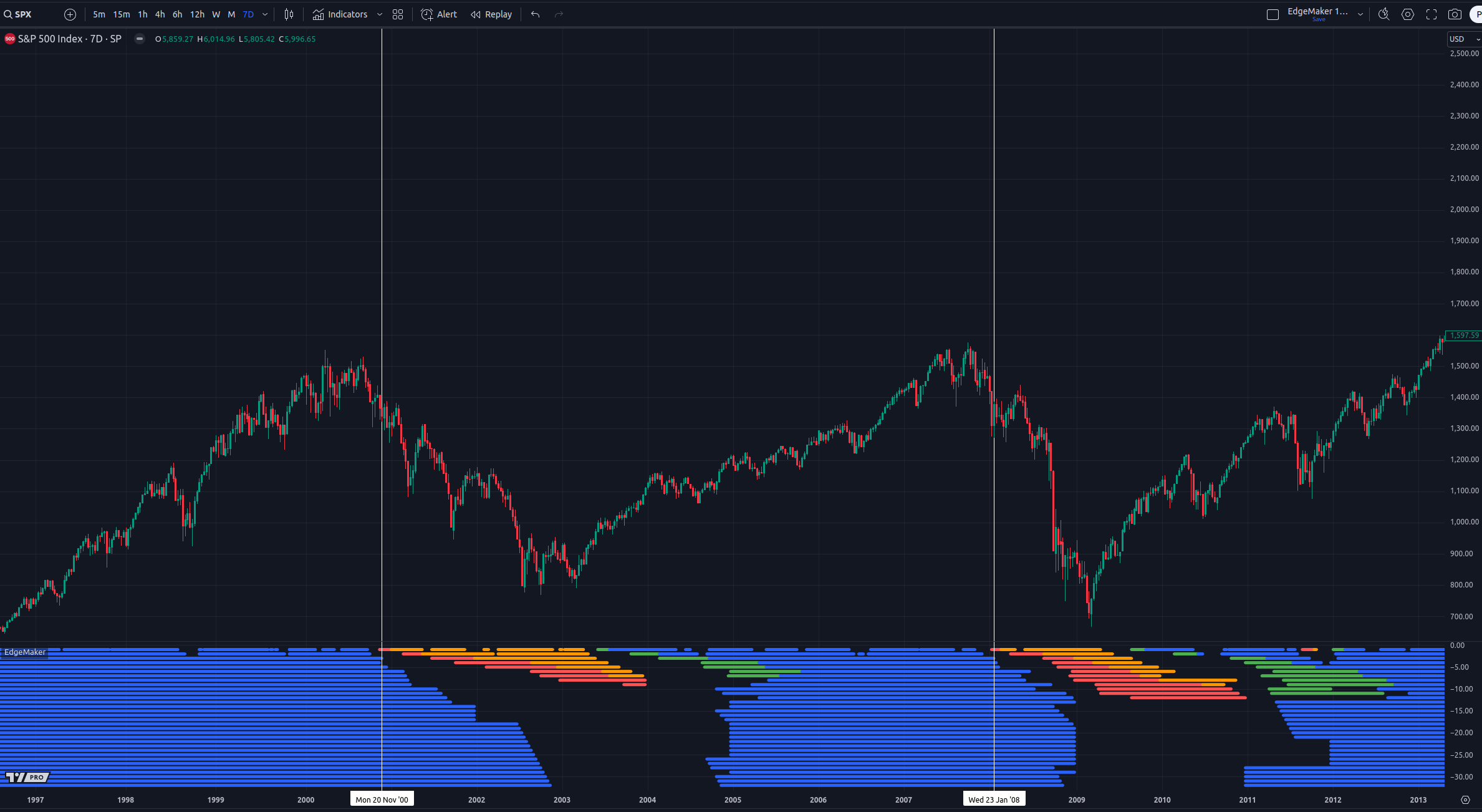
Bearish compression appeared on the first layer (7d) on November 20, 2000. The last time 7d had bearish compression was in December of 1994, which failed to expand and lead to a 200% price increase over the next 6 years.
Bulls reclaimed 7d compression on June 13, 2003 and had a nice run until October 3, 2007, when price peaked at $1,554.41.
The second vertical line in the chart above shows bearish 7d compression on January 23, 2008, which represents the early price action prior to the 2008 Financial Crisis.
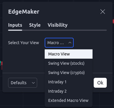
7d printed bullish compression on September 2, 2009. Now let’s zoom in further by selecting Macro View in the indicator settings:
Macro View uses 30 layers (1-30d) with a chart interval of 1d.
Let’s take a look at the 2008 Financial Crisis:
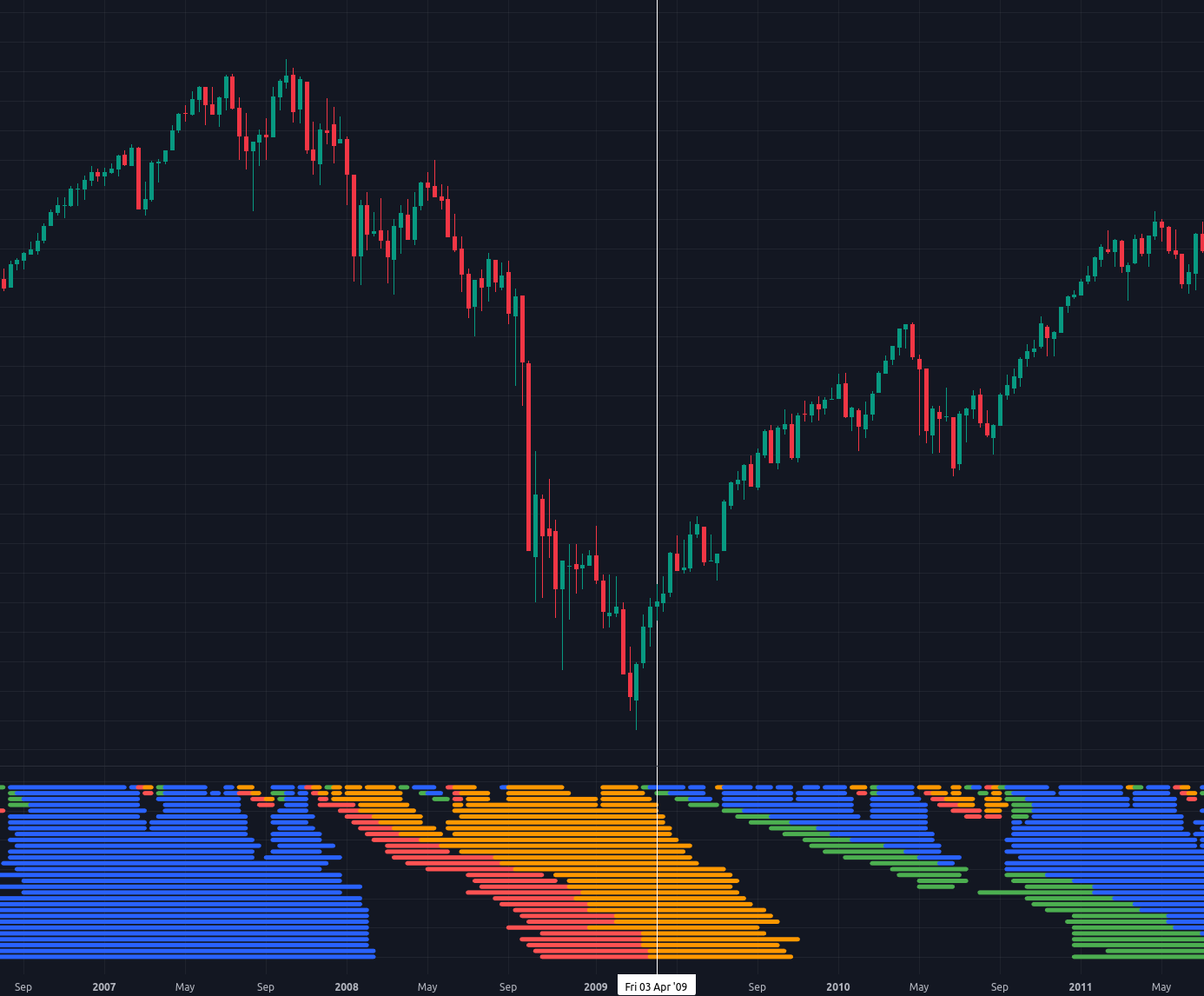
The vertical line marked on April 3, 2009 represents the first time in 1.5 years where bullish compression was higher than bearish compression across time frames. On that day, there was bullish expansion on 1d and bullish compression on 2d, which was a good sign (bears were ready for hibernation).
I know this is a macro post, but allow me to show you a lower time frame example of $SPX by selecting the ‘Swing View’ option within the EdgeMaker indicator settings:
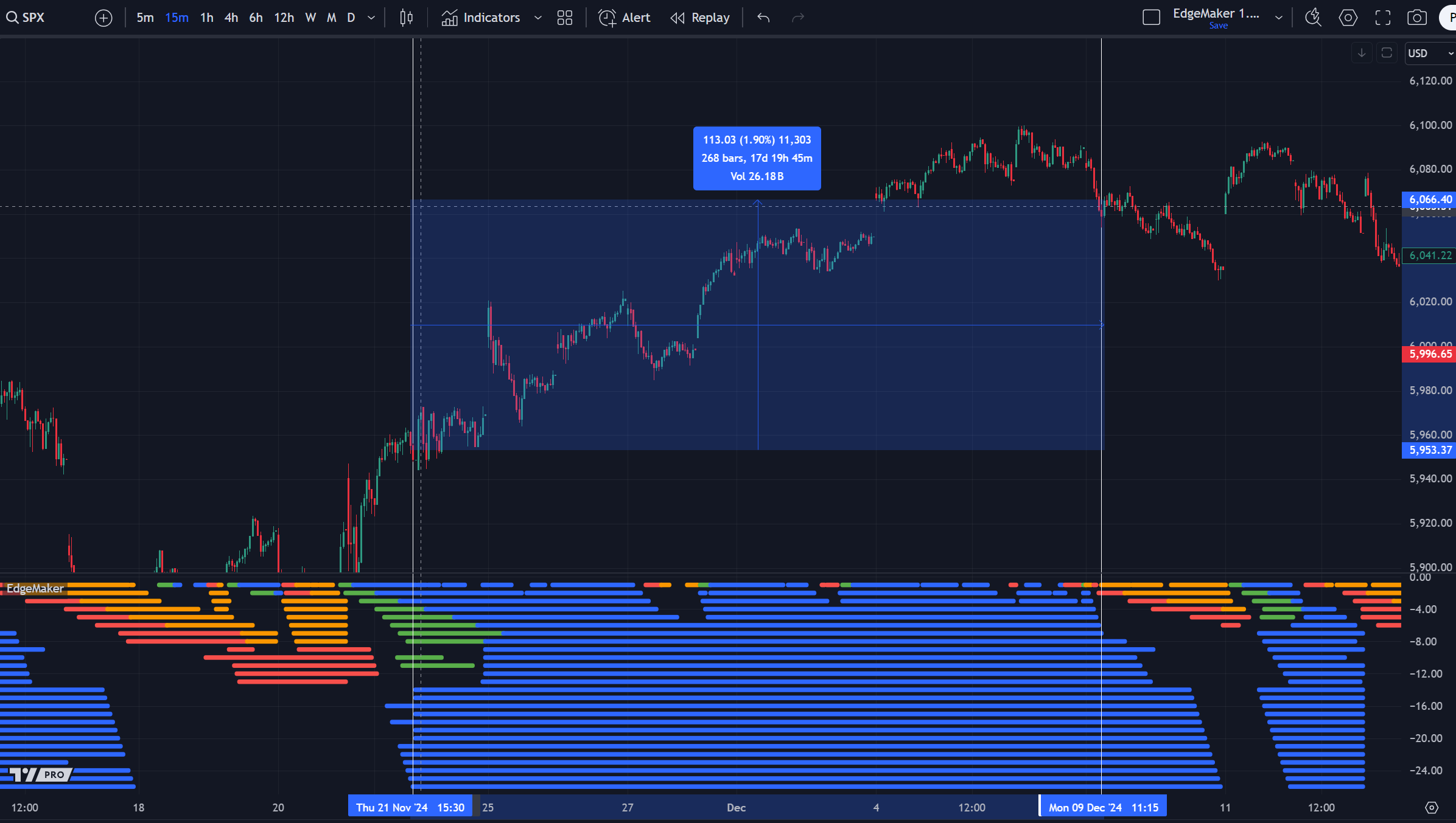
The Swing View contains 26 layers. Each layer represents a time frame which increments by 15 minutes. So the complete range is 15m to 390m.
The first vertical line in the screenshot above is set to November 21, 2024 at 3:30pm. I selected this specific time because bulls were showing nice compression across 7 time frames, while bearish compression and expansion clearly failed to continue.
The second vertical line was placed on December 9, 2024 at 11:15am. This is when the second layer (30m) began to show bearish compression.
Now here’s an intraday example:
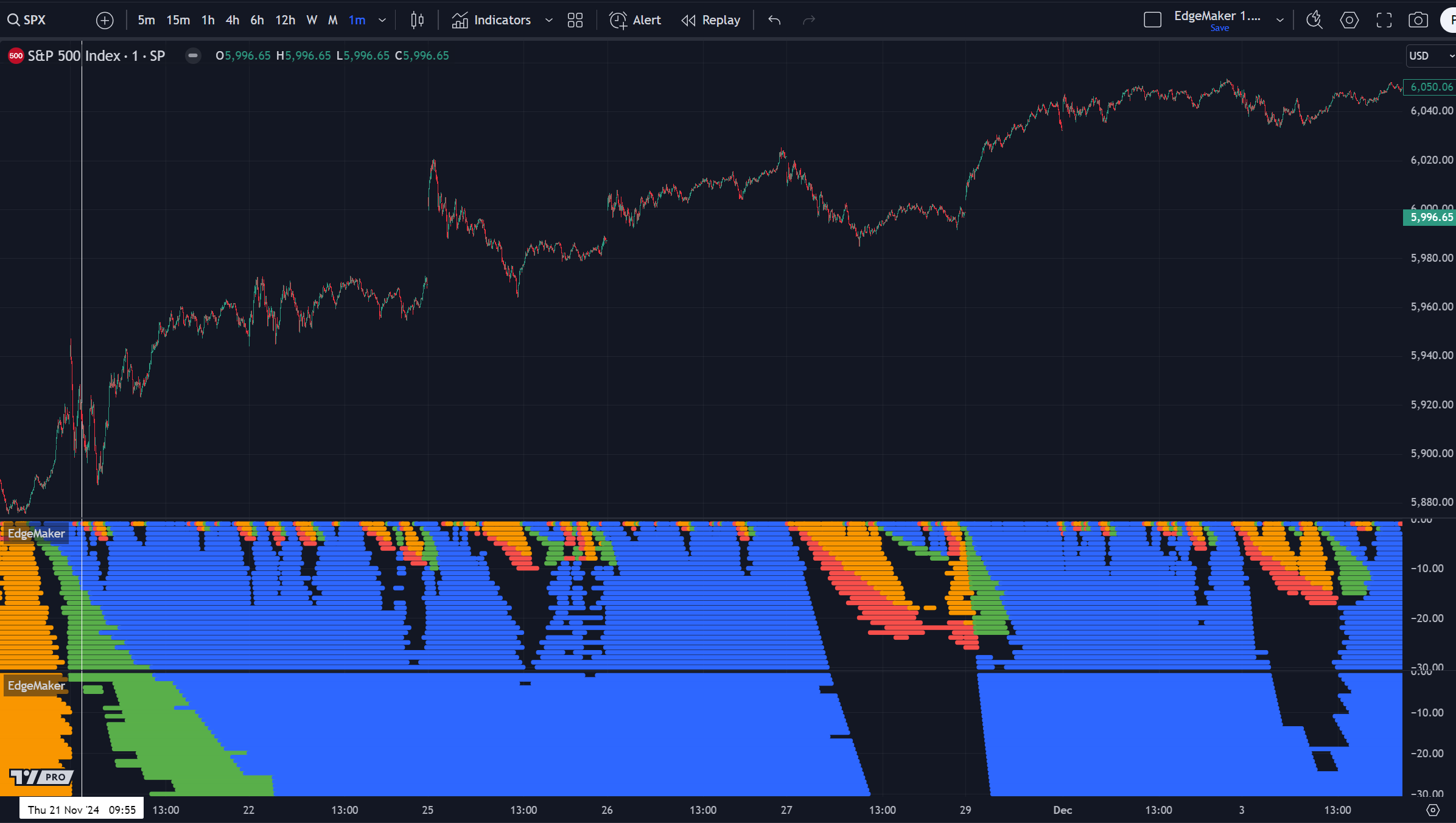
In this example, there are two copies of EdgeMaker. The first covers 1-30m time frames and the second 31-60m. This allows us to identify scenarios where there is significant bullish compression across many time frames and minimal bearish resistance.
Now take a look below at the intraday views (1-60m) for $SPX on January 15, 2025:
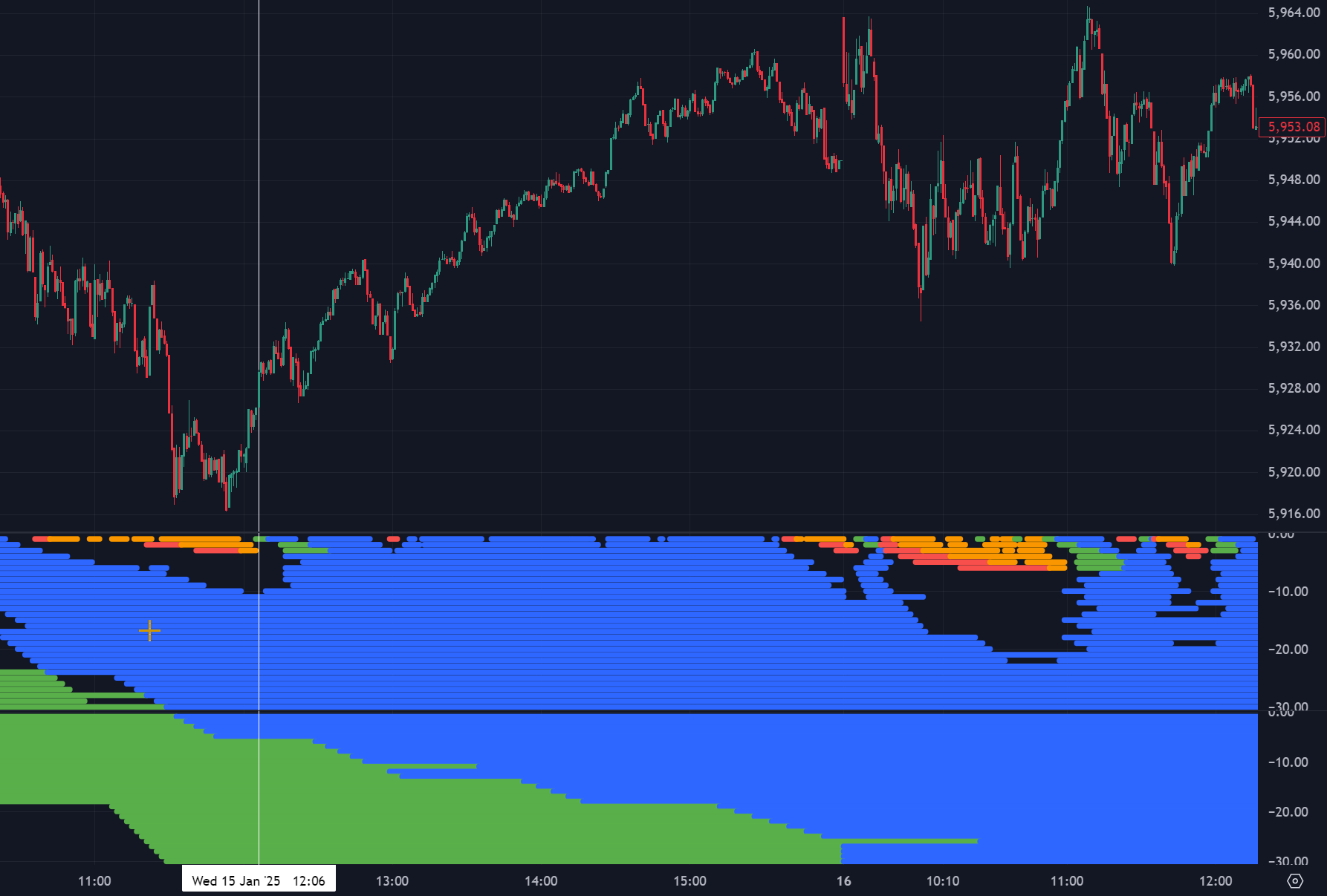
EdgeMaker just printed a bullish recompression on 1m, following a correction that failed at 3m and there is plenty of bullish expansion and compression below (from around 11m to 60m).
In my opinion, this could be a great entry for intraday and even short swing trades. The same sharp entry strategy could be applied to longer-term trades, if higher time frames are also in confluence.
2025 Outlook
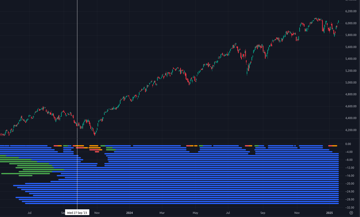
On January 2, 2025, EdgeMaker printed bearish compression on 1D. On lower time frames I see EdgeMaker is showing that bulls have reclaimed compression. However, if bears take 2D and beyond, expect a decent correction in 2025.
The last time $SPX showed bearish compression on at least 2D was September 27, 2023. So in my opinion, another one is overdue.
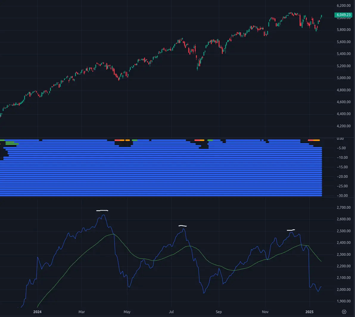
Here’s another interesting observation using the EdgeMaker Macro View (above). I added our EdgePower indicator, which has shown decreasing peaks throughout 2024.
The next 30 to 40 days will be key. If we do not see a higher EdgePower peak, this will indicate that a correction may be near.
If EdgePower drops below 1500 in the MacroView (and stays there), expect a potentially significant $SPX correction in 2025. I will cover the EdgePower indicator in more detail in a separate post.
I hope you enjoyed my first Substack post. Feel free to share your feedback and ask questions in the comments below.
I will make this indicator available to paid subscribers in the coming weeks.
Cheers,
Mr. Edge